Milkin’ More
Re-brand
Naming
Logo Development
Packaging Design
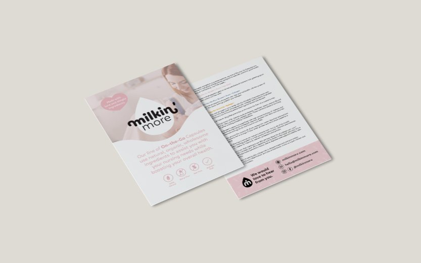
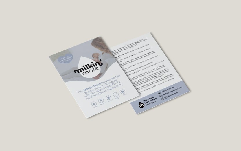
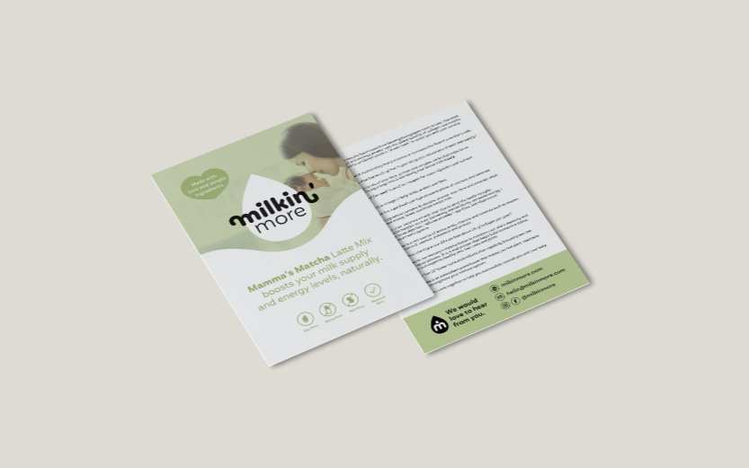
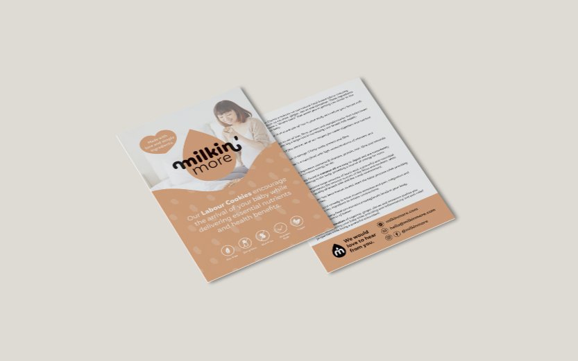
Pamphlet Design
Brochure Design
Trade Show Display Design
Shipping Box Label Design
eCommerce Website Design and Development
Business Card Design
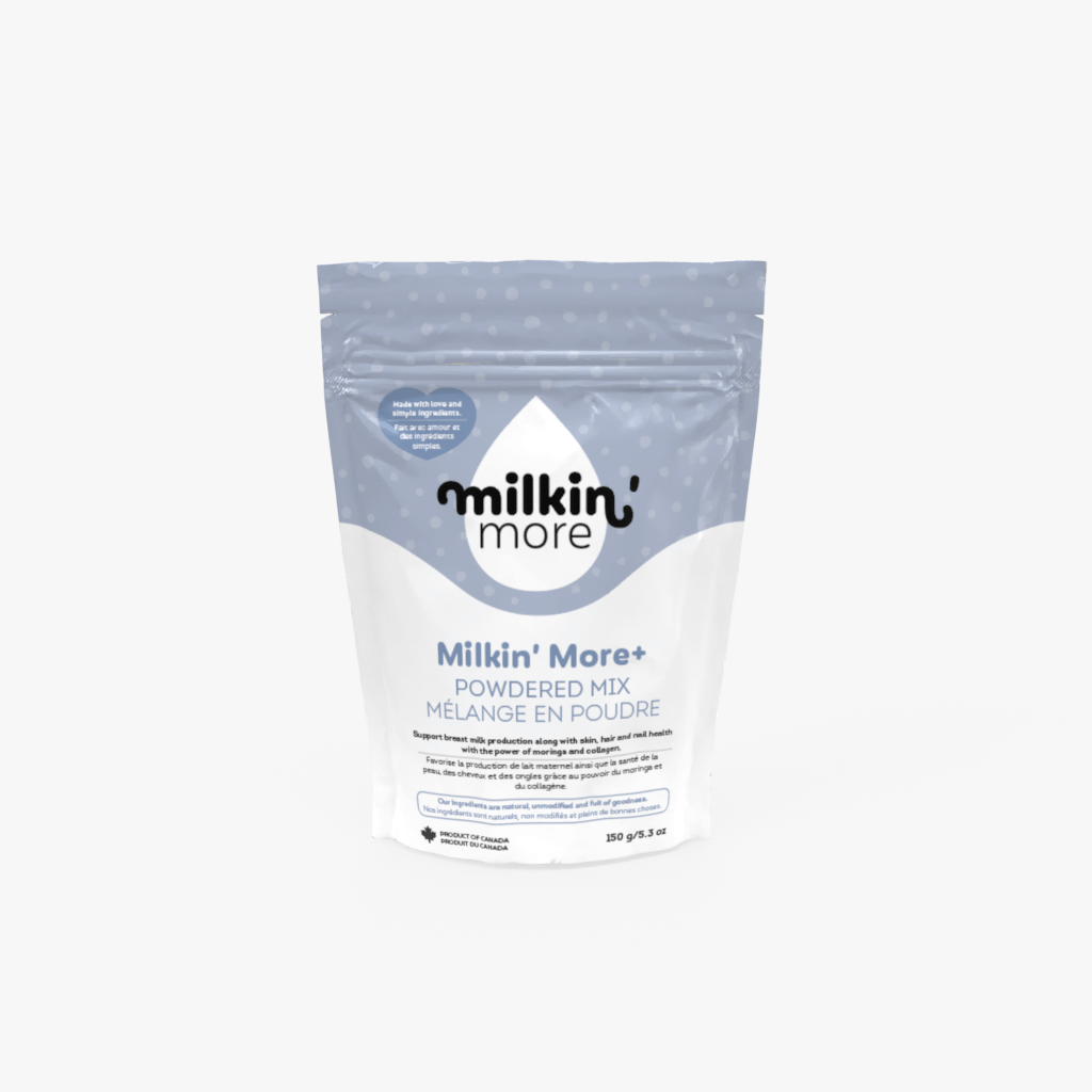
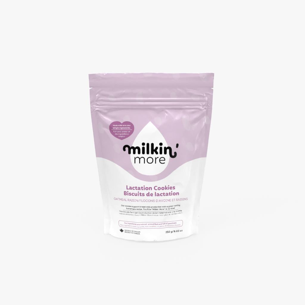
Milkin’ More, formally known as SKTN Mini Eats creates products that help mothers with breastfeeding, postpartum recovery and overall nutrition. The name SKTN Mini Eats didn’t lend well to growth as it didn’t capture the essence of their products. After a brainstorm, we came up with the name Milkin’ More. Milkin’ More’s owners Jaclyn and KJ desire to create products without any preservatives and unnecessary ingredients, which led to the tagline “Made with love and simple ingredients”.


By keeping the logo colours neutral, this left room to use different colours in all of the other creative elements.
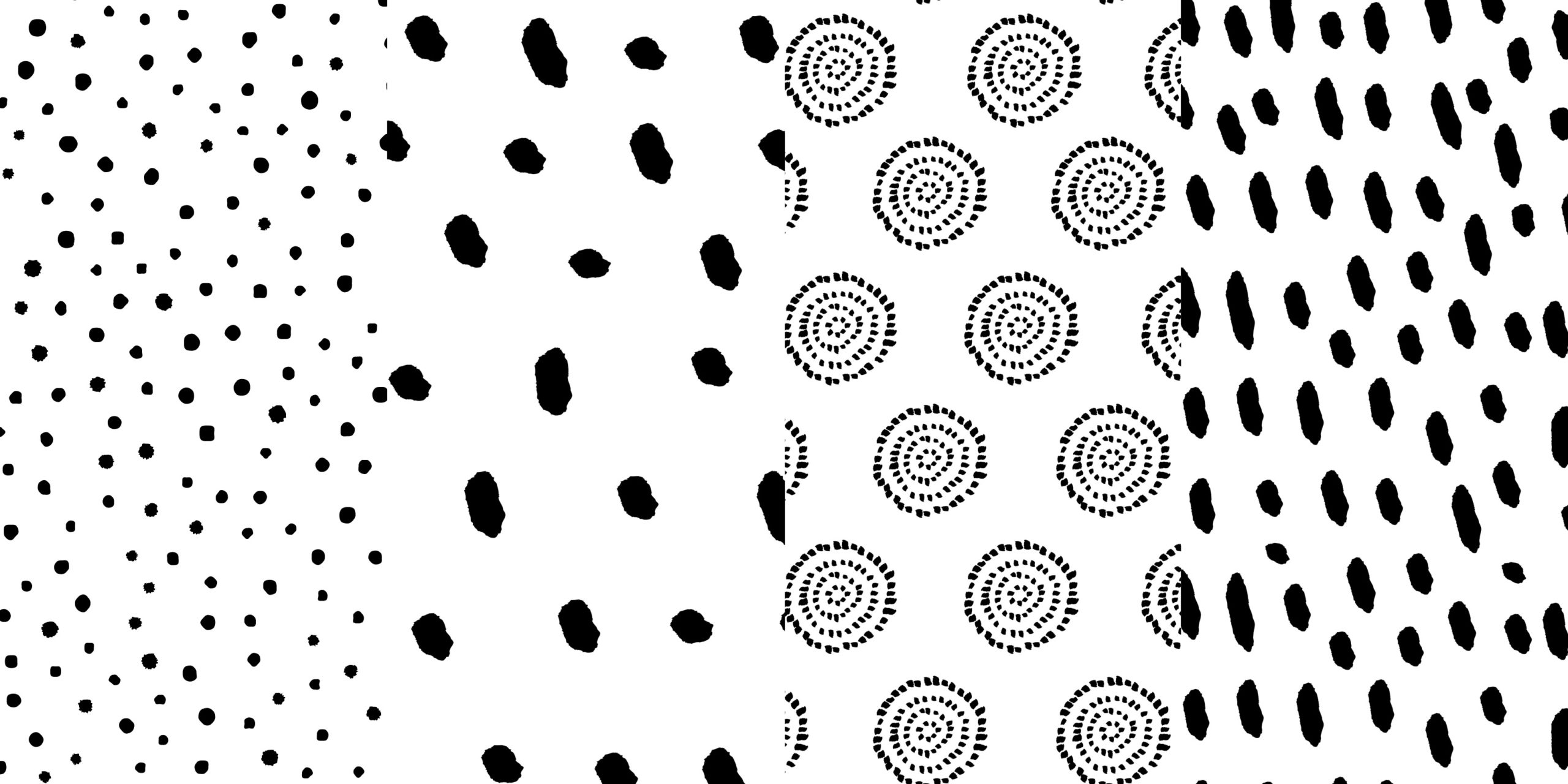
We had a blast creating patterns and using a wide variety of colours for their ever-expanding product line. The wave under the logo is a touch conceptual relating to the flowing motion of liquid as well as the general child-birthing position, which stands out for the labour cookie packaging.
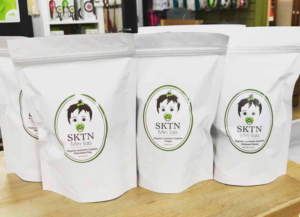
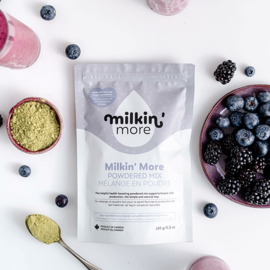


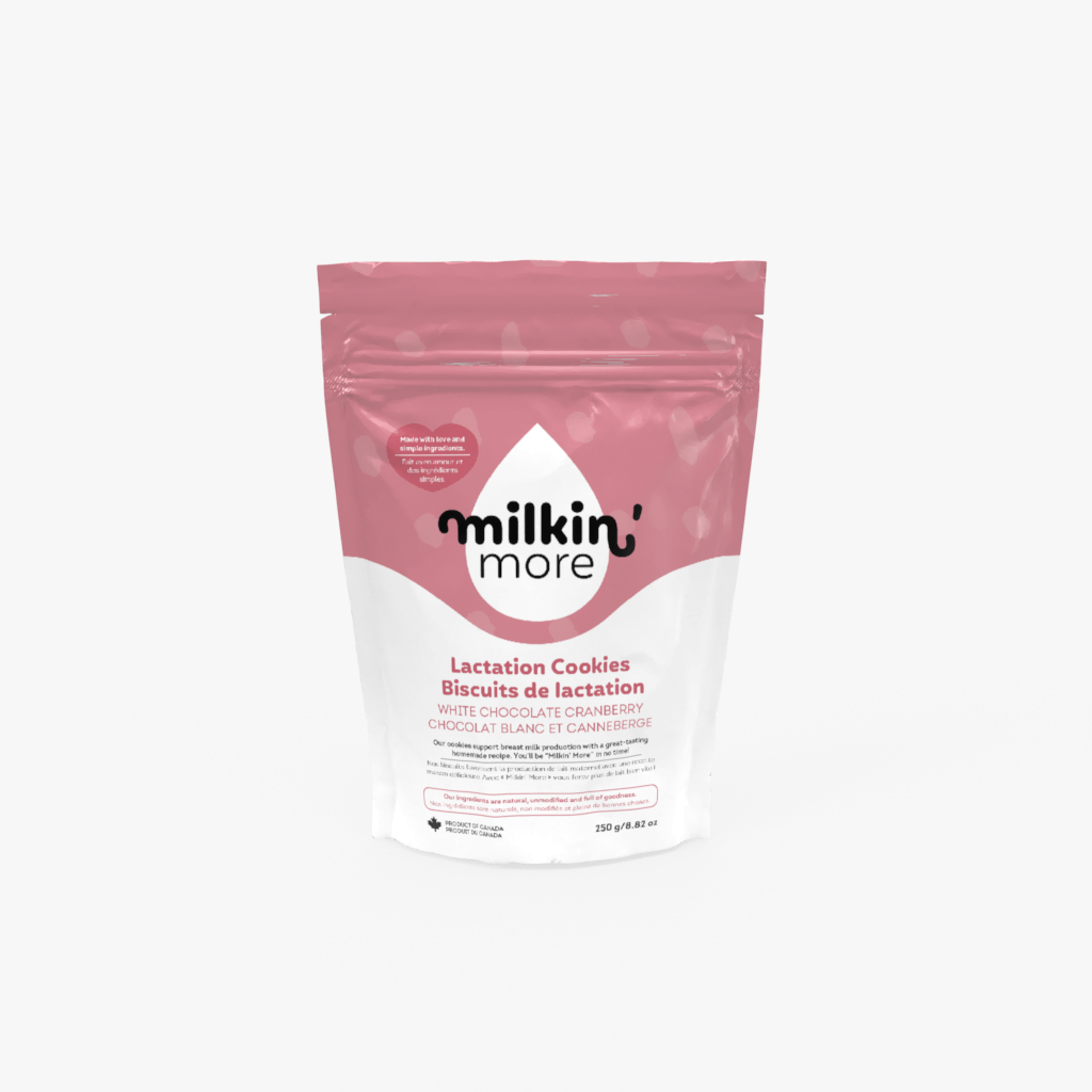
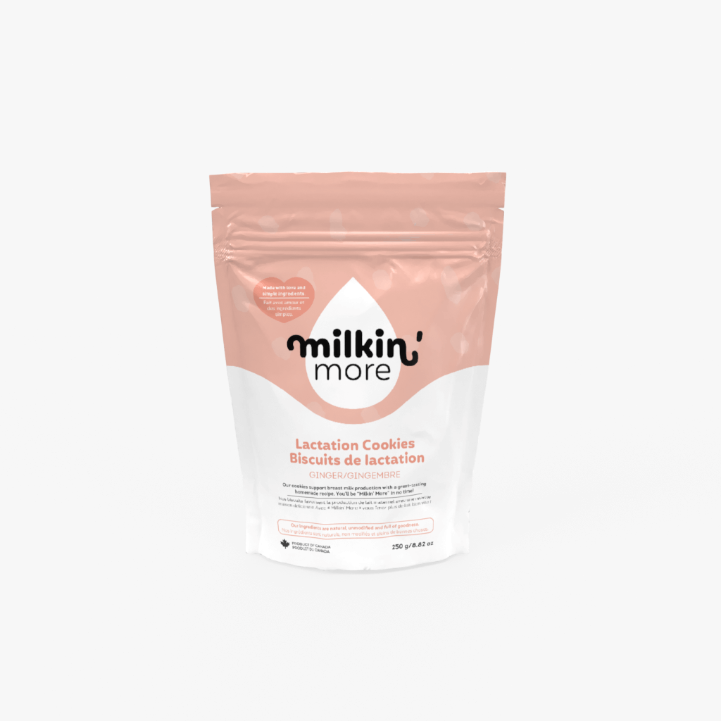
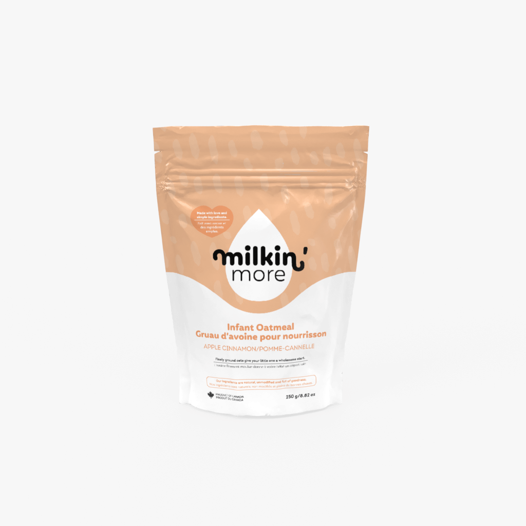
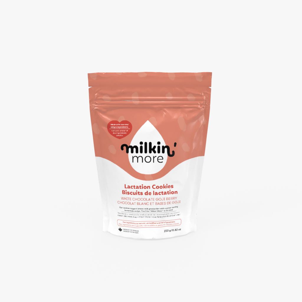
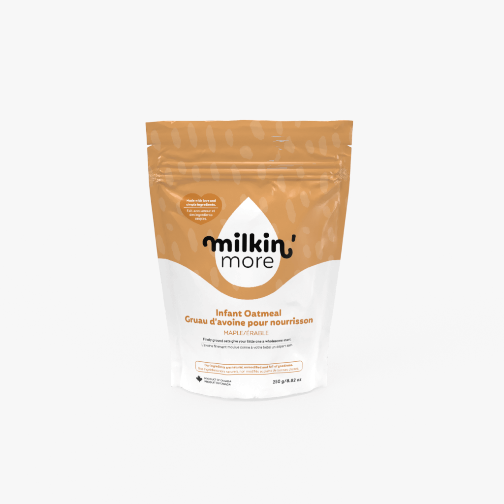
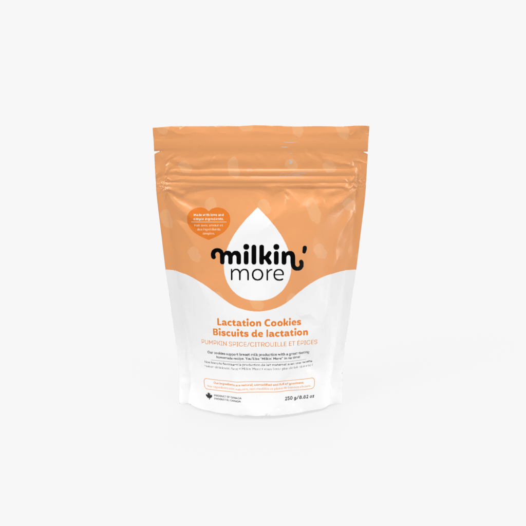
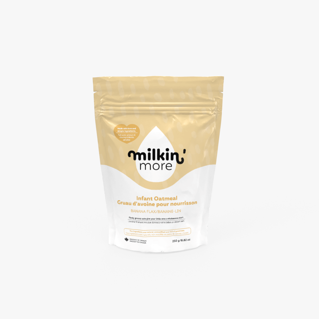
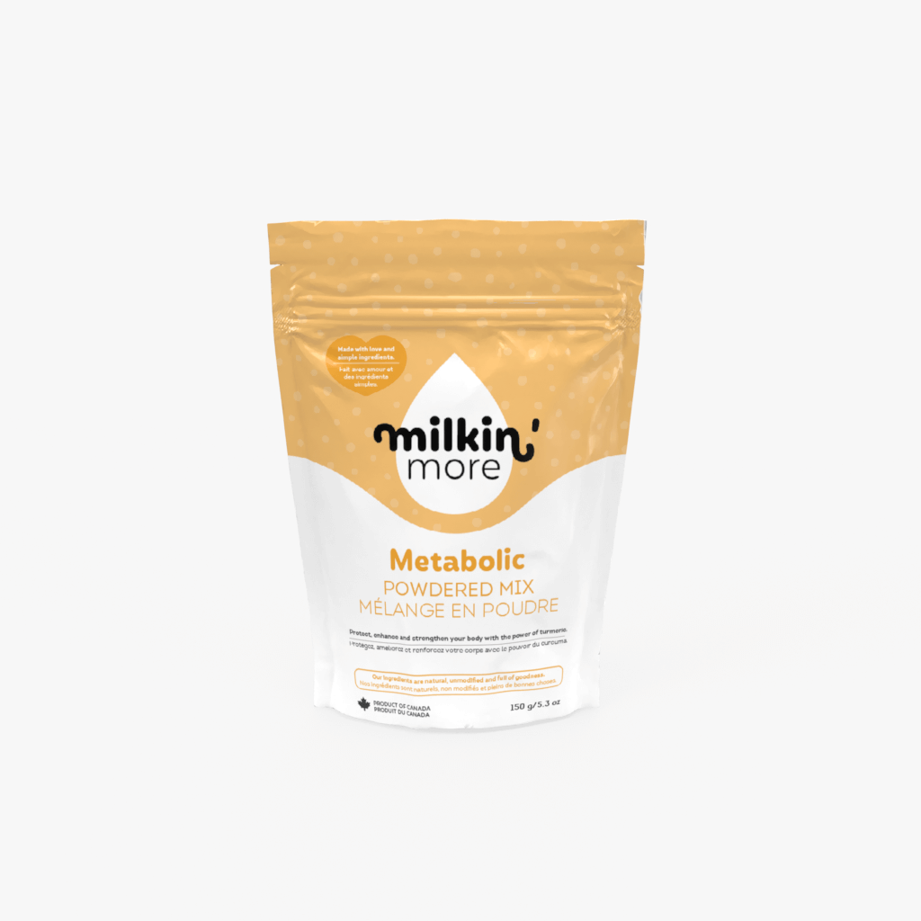
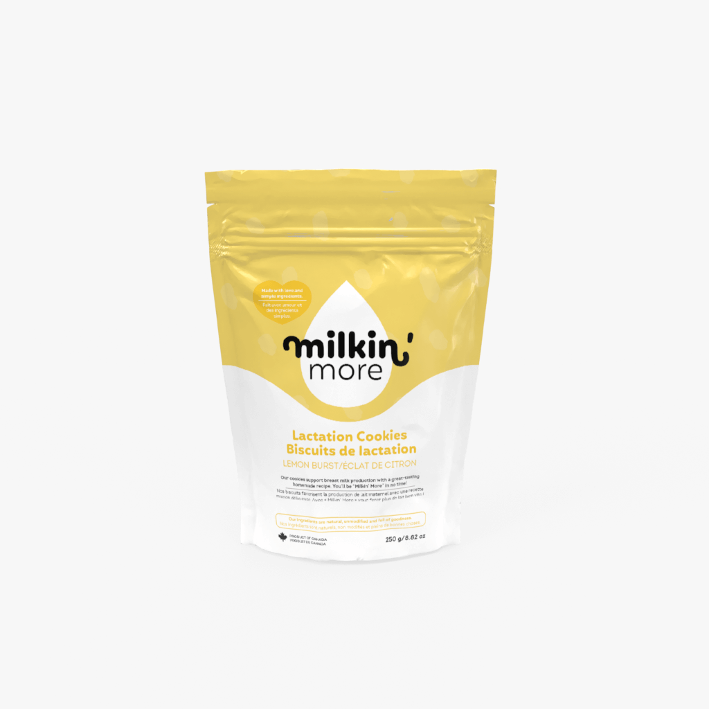

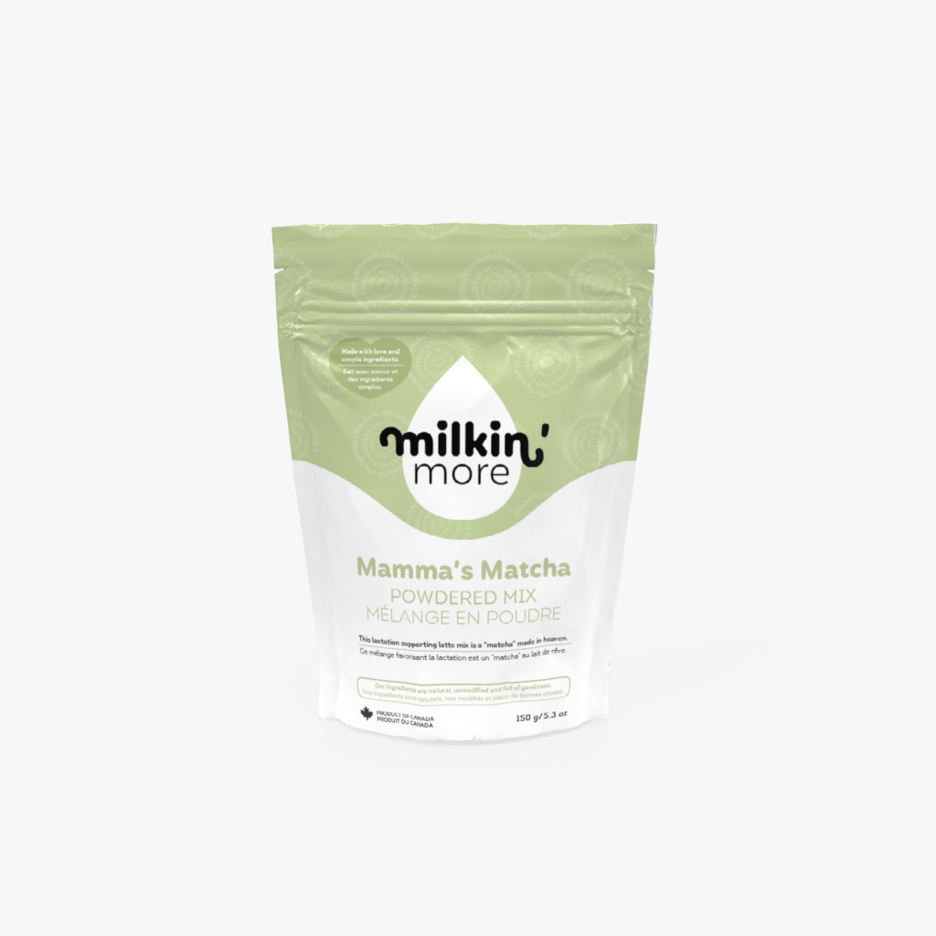
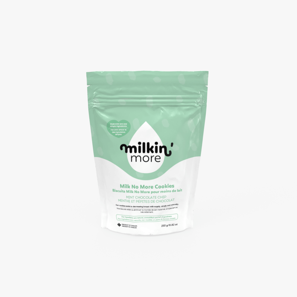
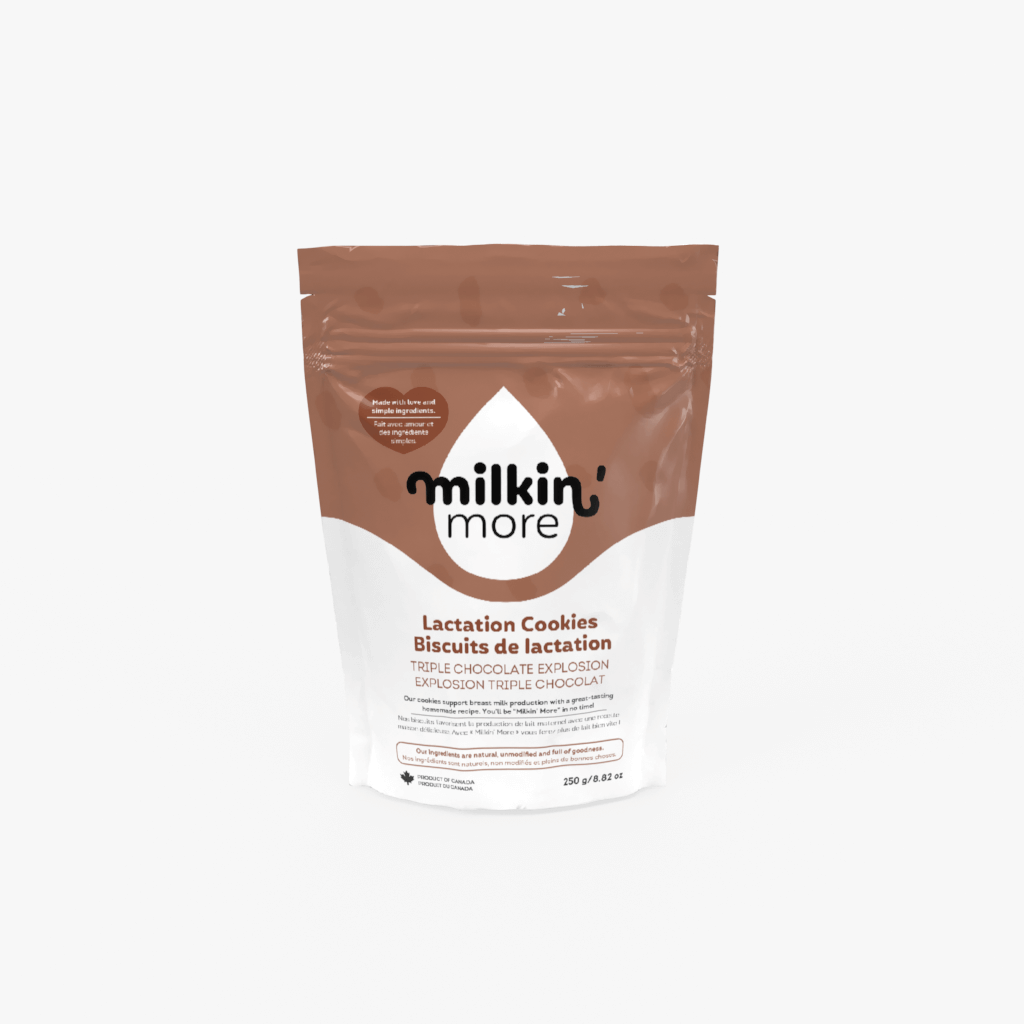
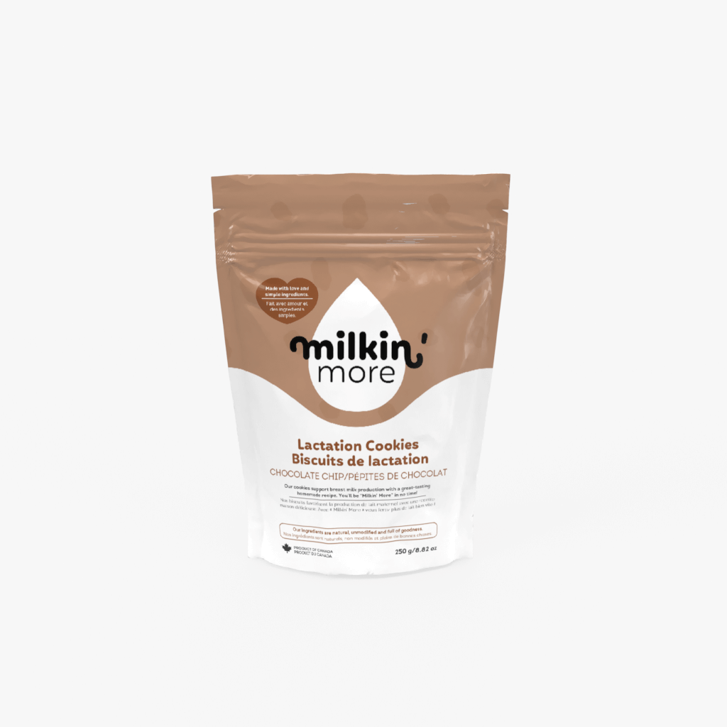
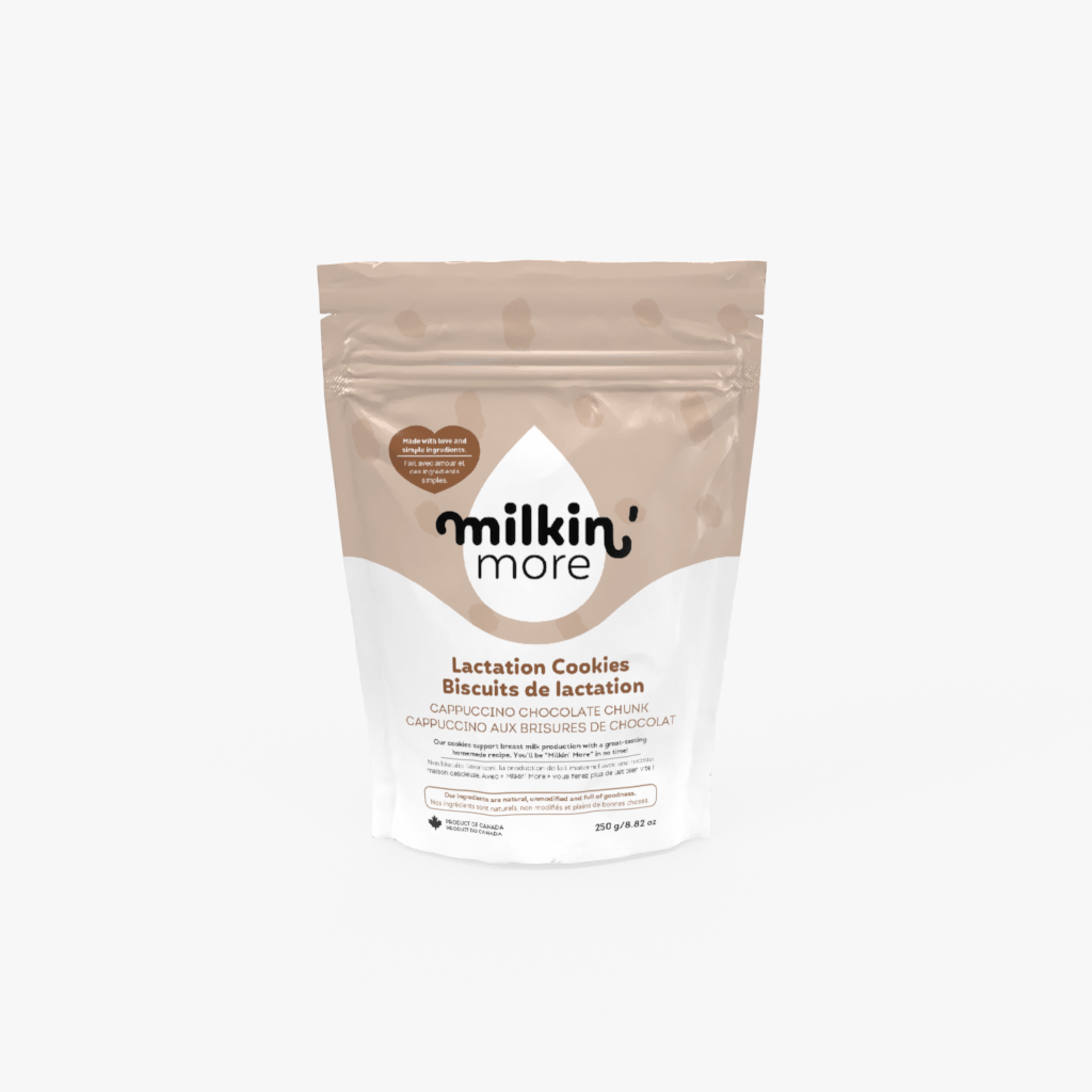
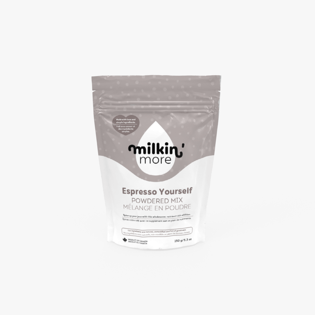
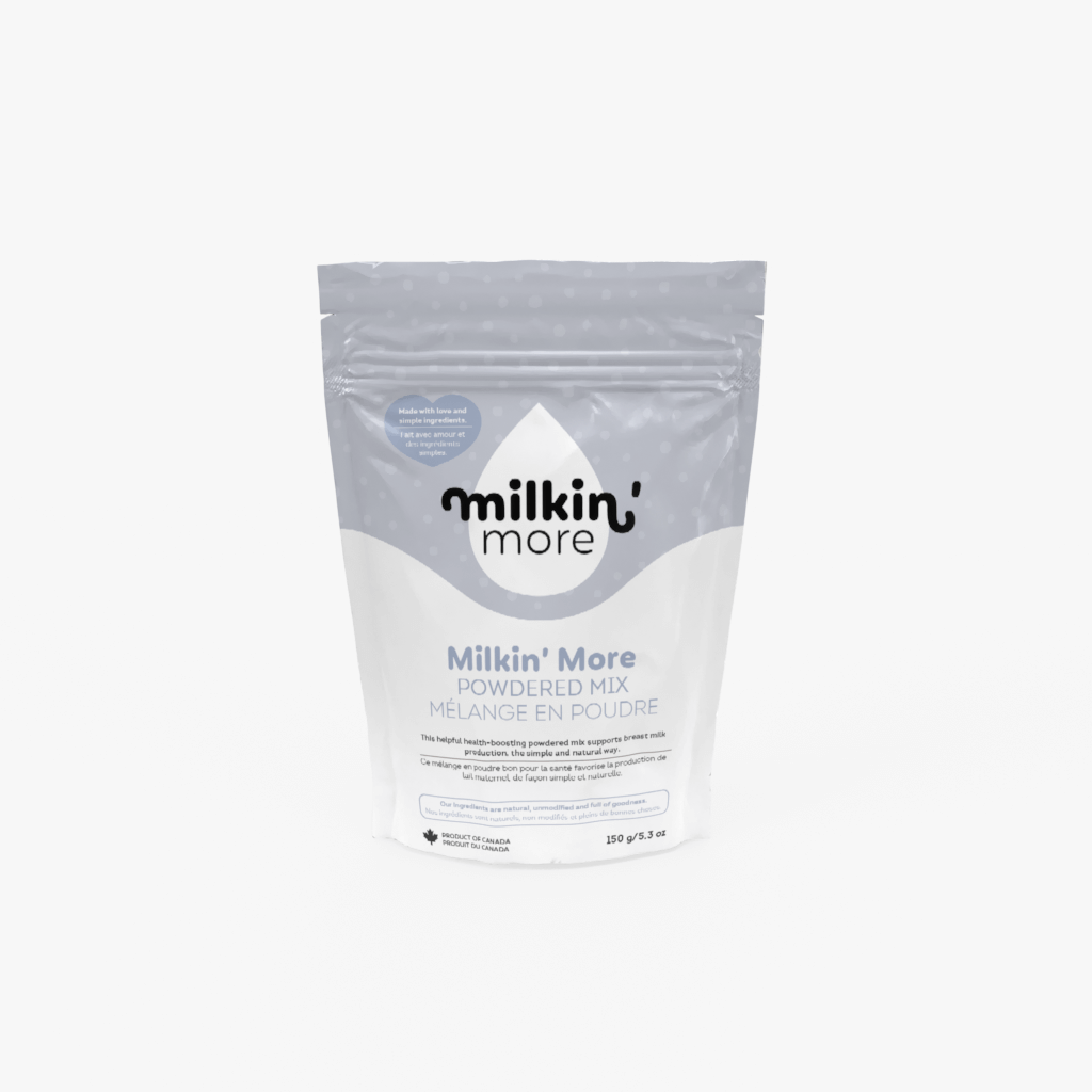
After the launch of the new brand, Milkin’ More’s sales 10x and they sold more in the first month than the entire previous year! Milkin’ more continues to grow and we are very happy to hear all of the stories of the moms their products are helping!
