Logo Development Colour & Pattern Development Email Signature Business Card Design Website Design & Development
About
Move~mint therapies offer physical therapy through a series of slow and subtle movements used to wake up the brain and offer new possibilities for people to move, think, and feel. Using the ABM® (Anat Baniel Method) of neuromovement® Therapy — an alternative and unique therapy approach that is catered to each person. Essentially, waking up the brain with the information it needs to upgrade its functions and improve physical, cognitive and emotional well-being. Serving children with special needs, chronic pain patients, stroke survivors and individuals with spinal cord and brain injuries.
We wanted to position move~mint as different from their competition due to the unique and alternative nature of their therapies. The brand was designed to embody the brand’s main characteristics – human, unique, change, transformation, growth, and flexibility. Movement and transformation are the main concepts (or stories) reflected in the brand. The move~mint brand consists of 3 elements used to tell their story. Elements consist of 1-Wordmark, 2-Line/Wave Pattern and 3-Colour Gradient. All elements are required to successfully speak in the desired tone of voice.
Previous
Next
Previous
Next
Logo Development
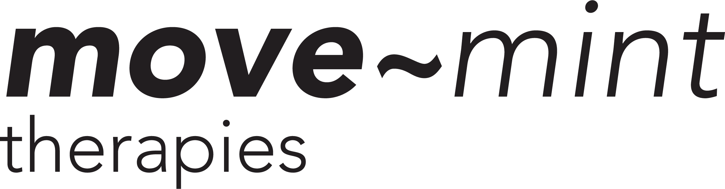
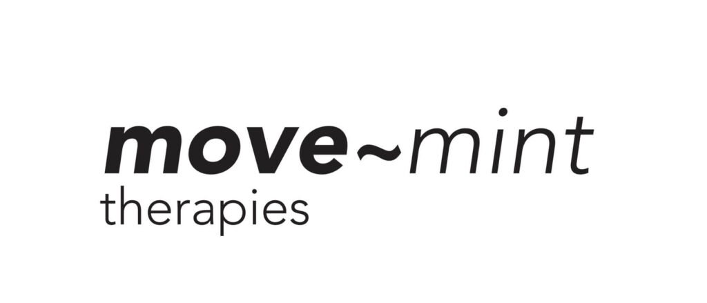
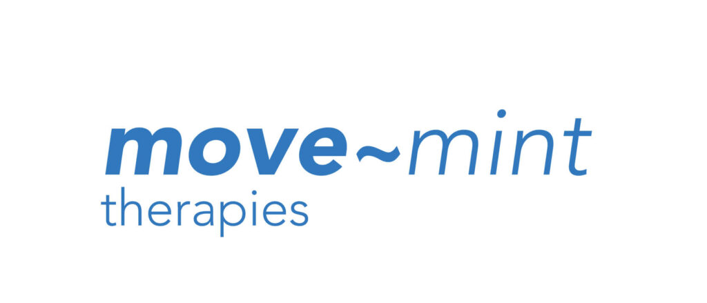
The logo or wordmark for move~mint embodies the brand’s main characteristics. It was developed to tell a story about change, transformation and growth. A story about movement is depicted through only using the oblique (or italic) fonts from the typeface Avenir. It is a rounded sans serif font which exhibits human qualities. While a narrative about transformation and growth is communication by changing the font weight from oblique black to oblique light. This symbolizes the journey in therapy from dark to light.
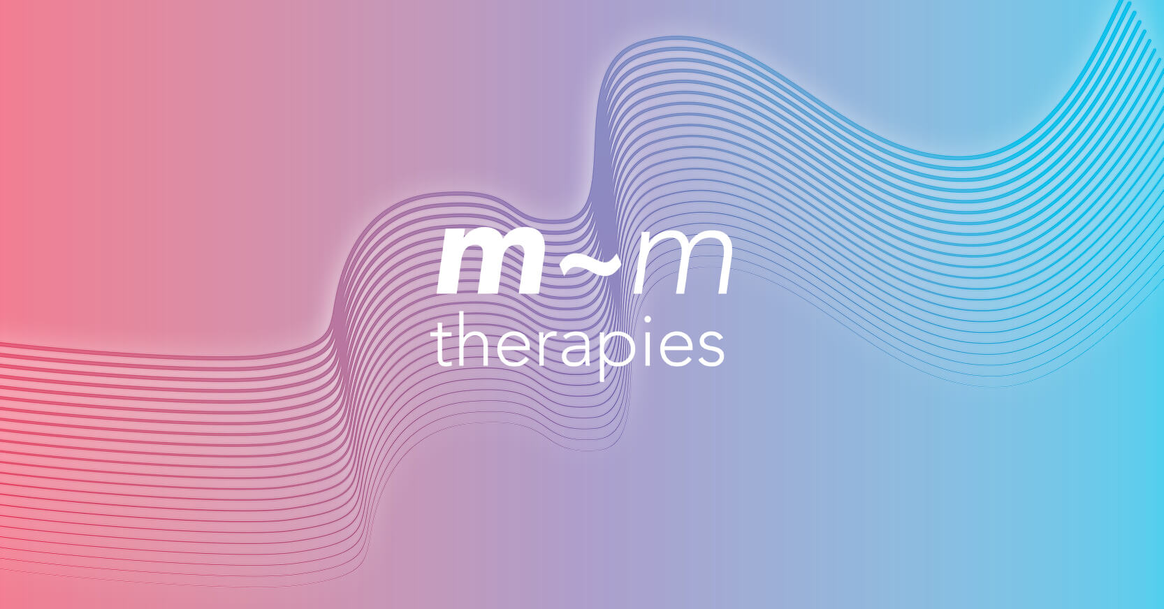
The name of the company incorporated a “hyphen” between it’s two words. A “~” tilde or ‘squiggle’ was introduced to replace the dash and further communicate the concept of movement. Flexibility was also designed into the brand mark through the use of a primary and secondary wordmarks “move~mint” and “m~m”, along with a single colour for use in any scenario.
Gentle
A soft spoken voice expressed with empathy and sensitivity.
Uplift
A sensitive message delivered in an uplifting manner.
Energy
As the name suggests, it is an energizing message.
Corporate
A serious message delivered in a professional voice.
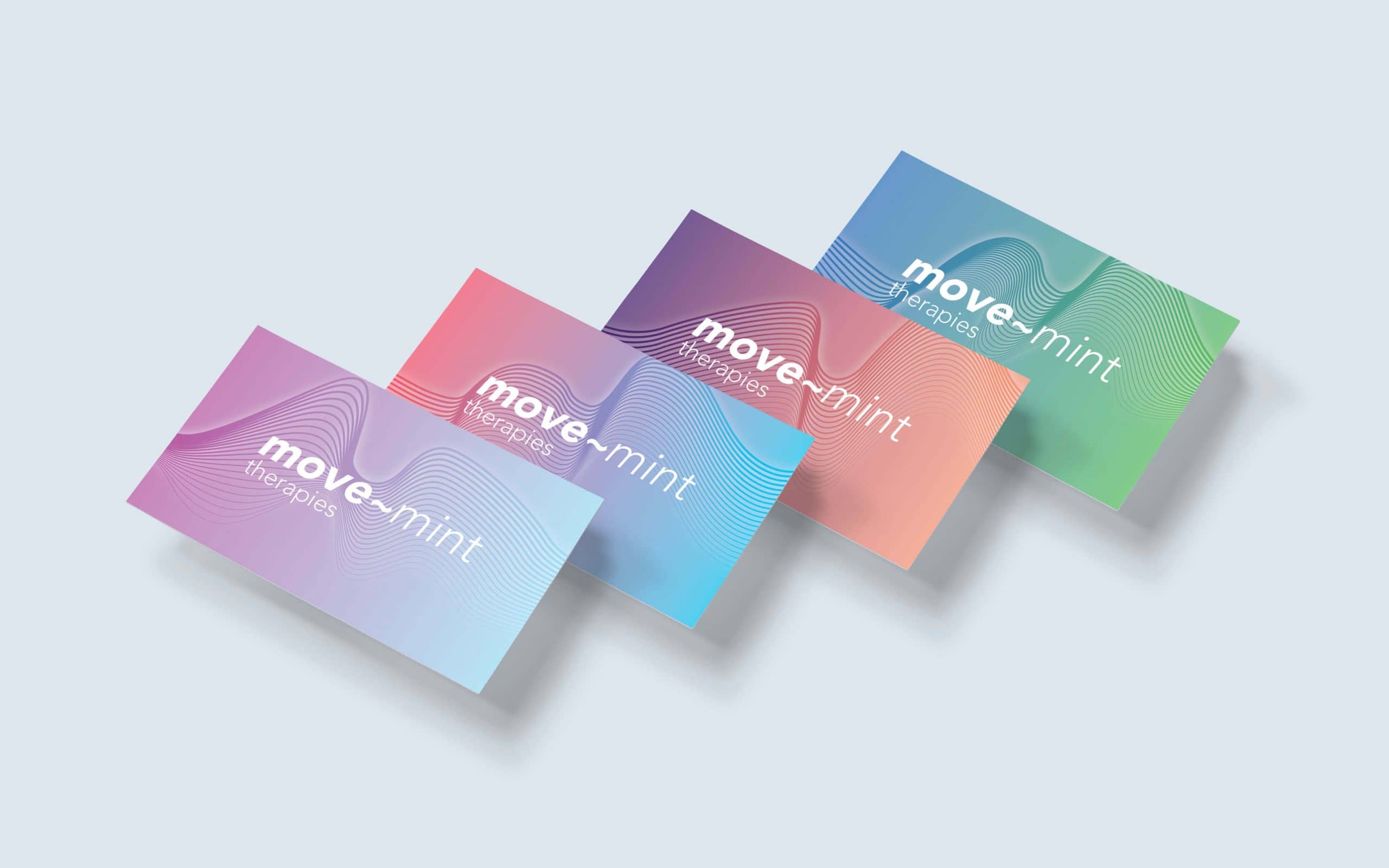
Colour & Pattern Development
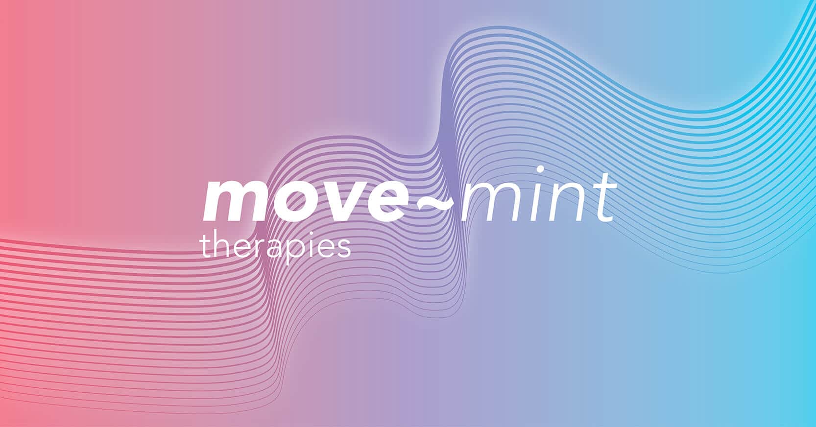
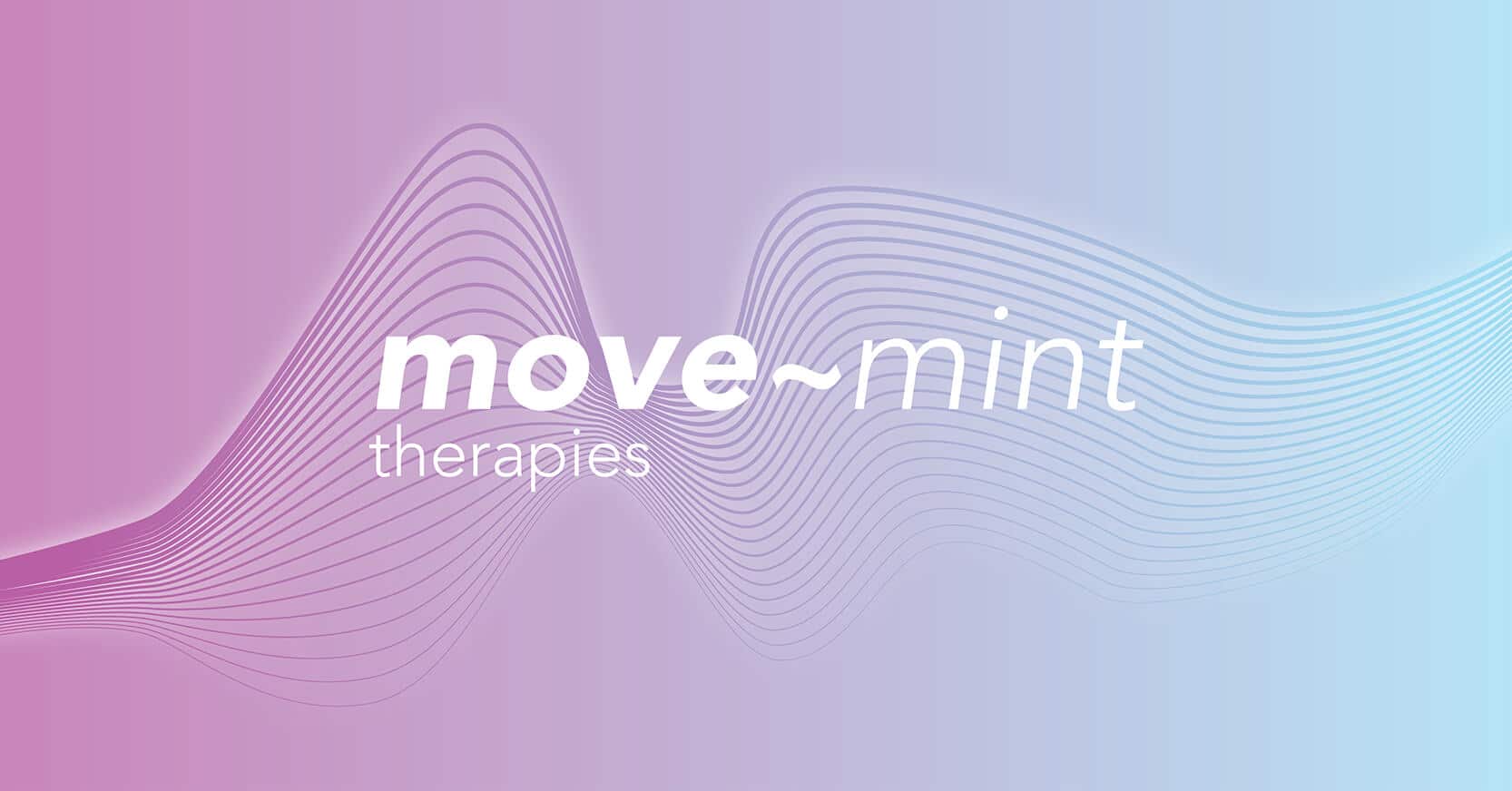
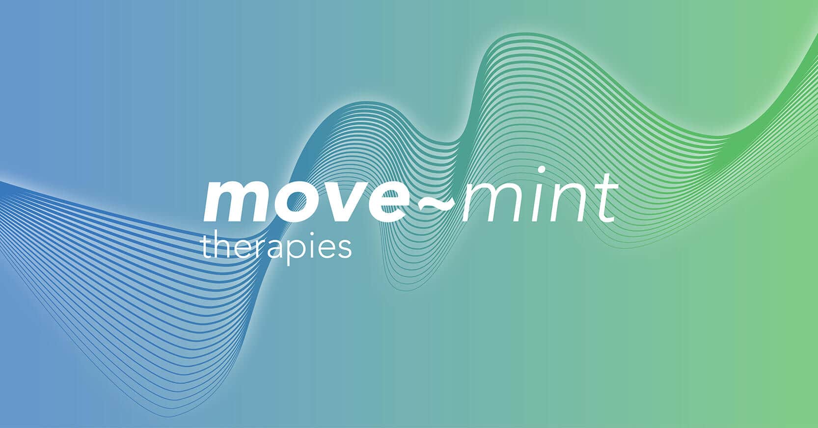
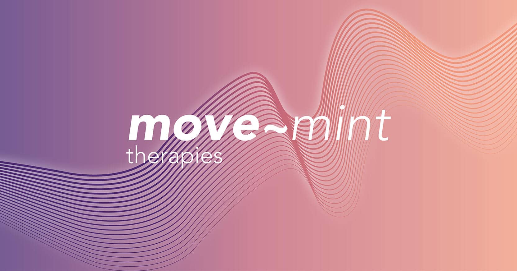
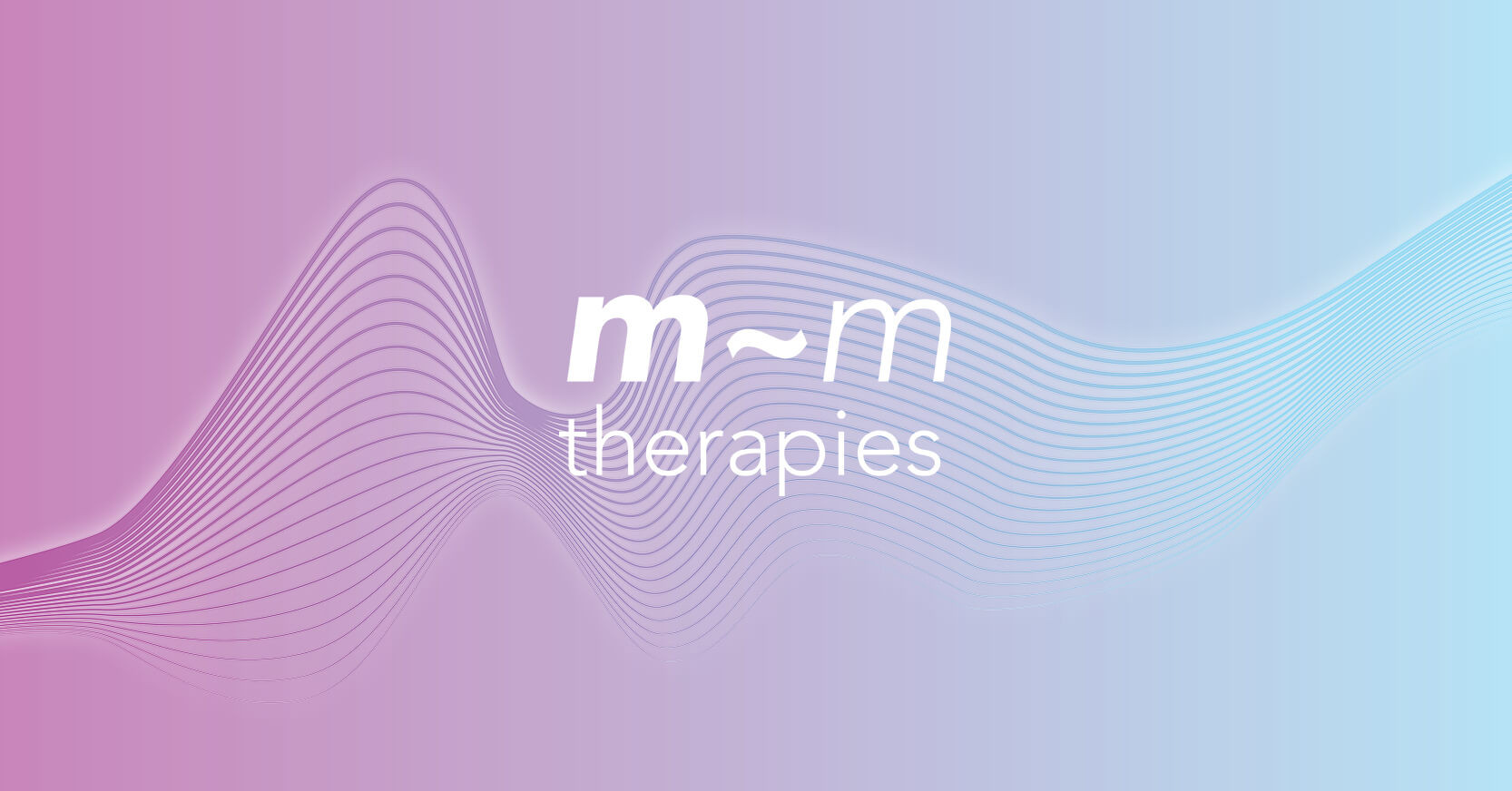
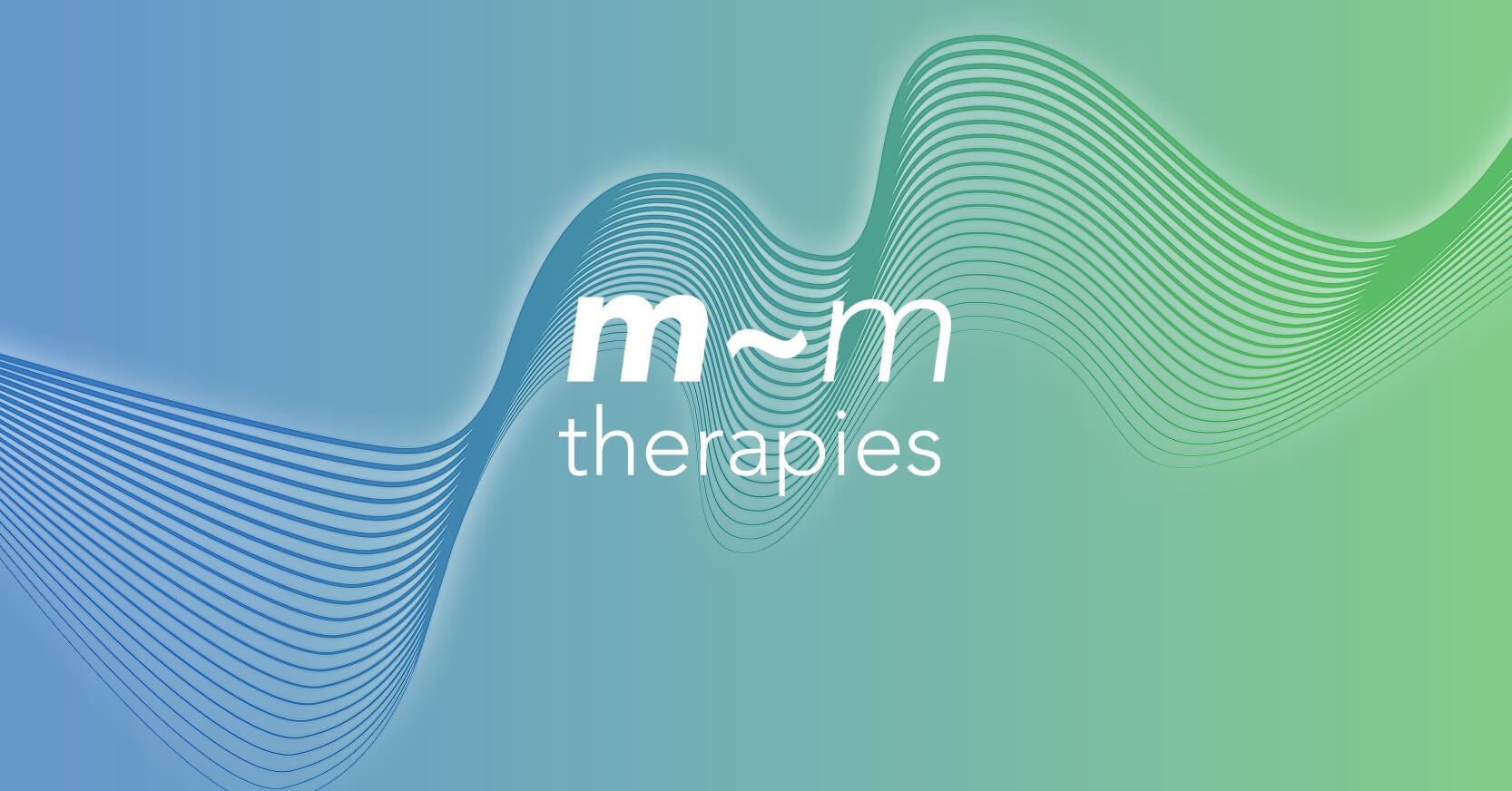
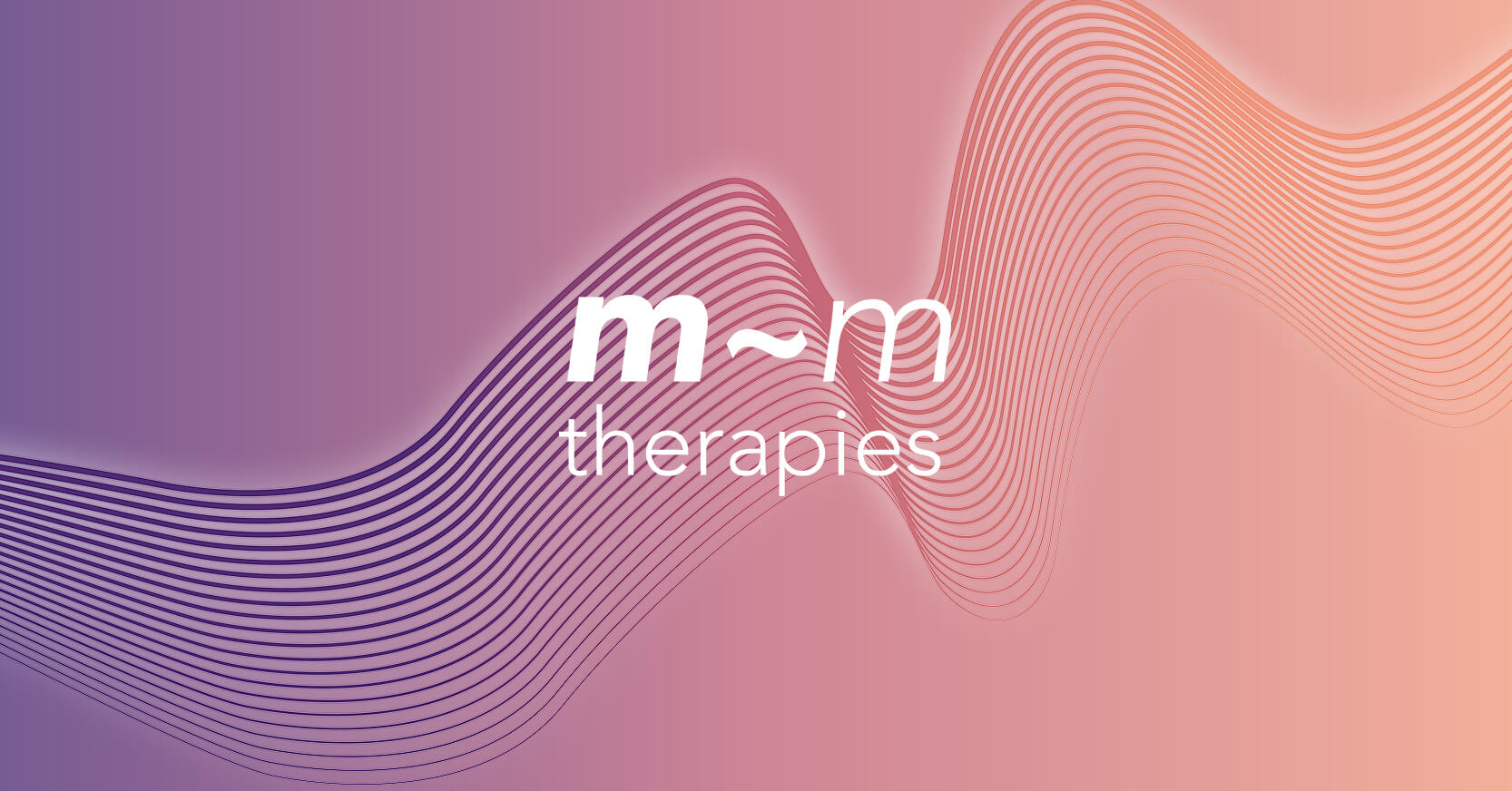
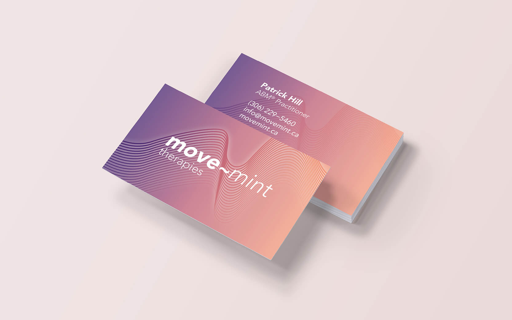
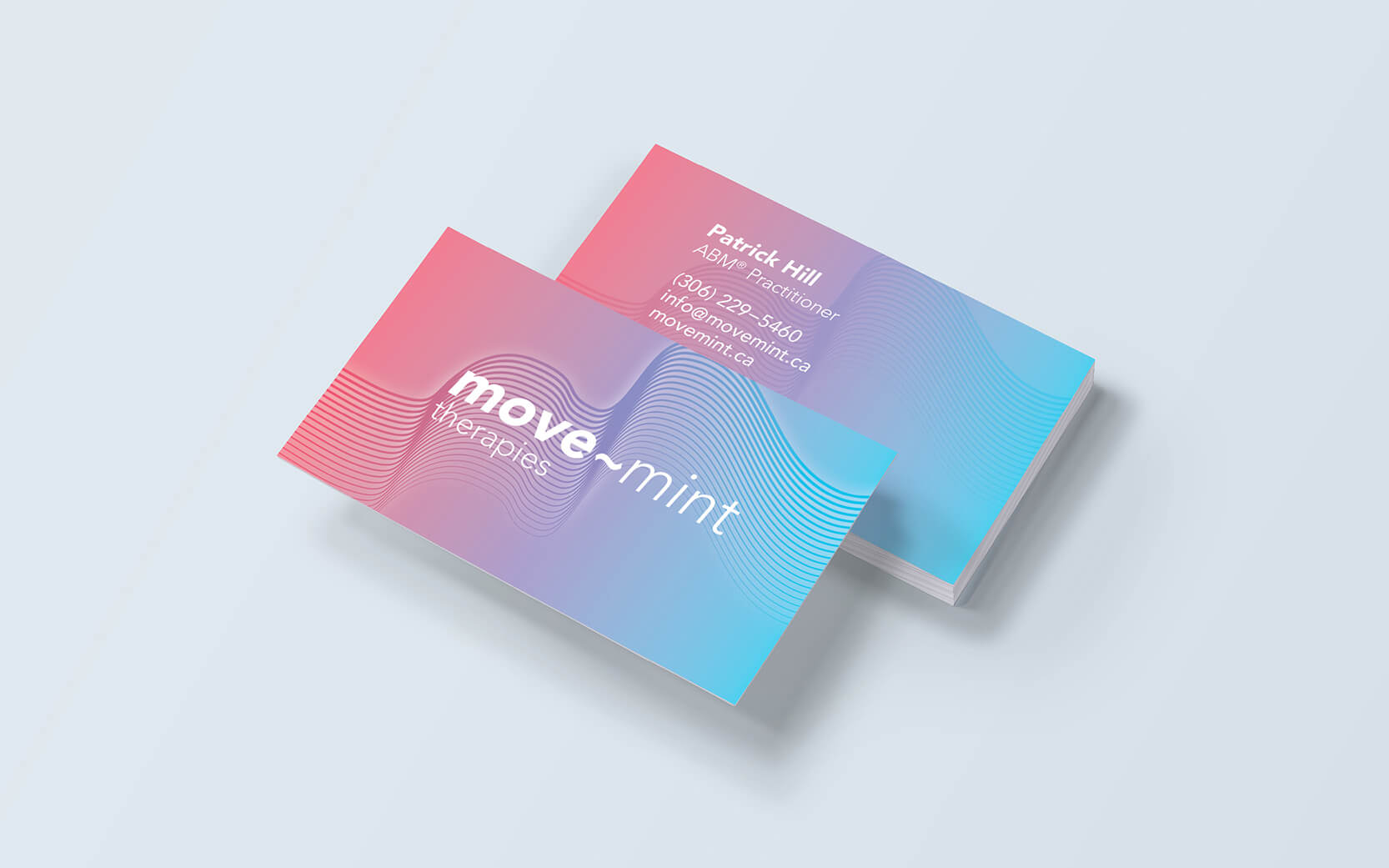
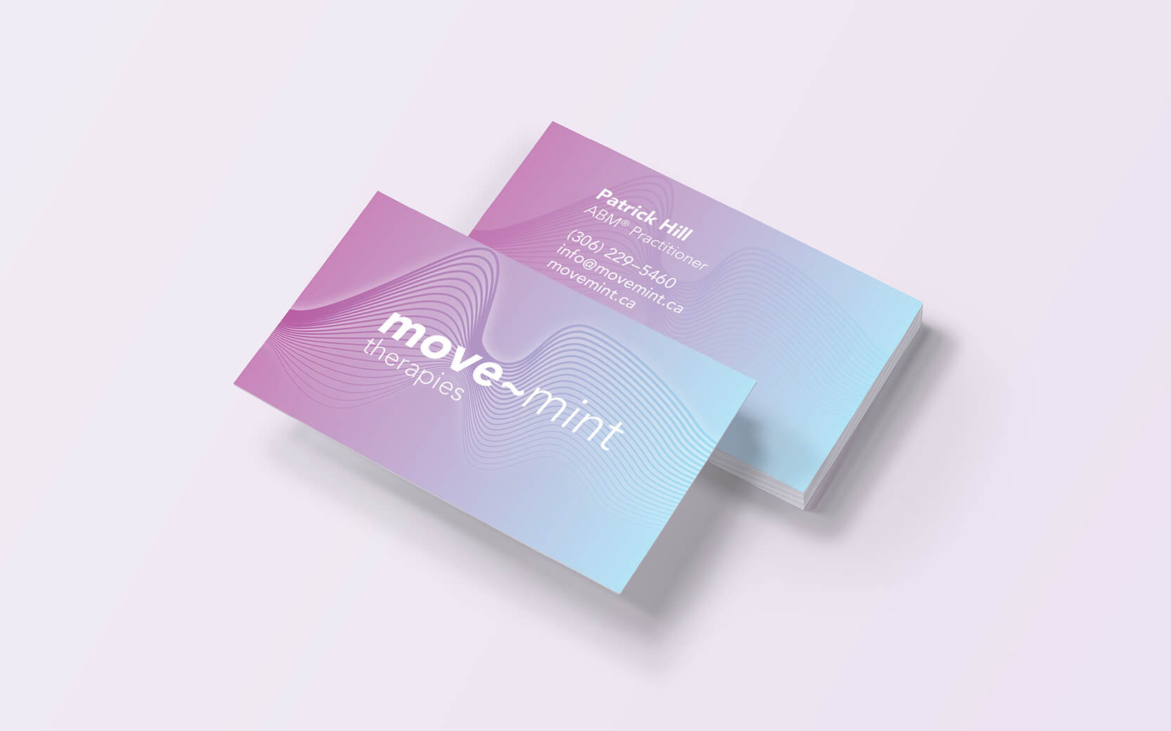
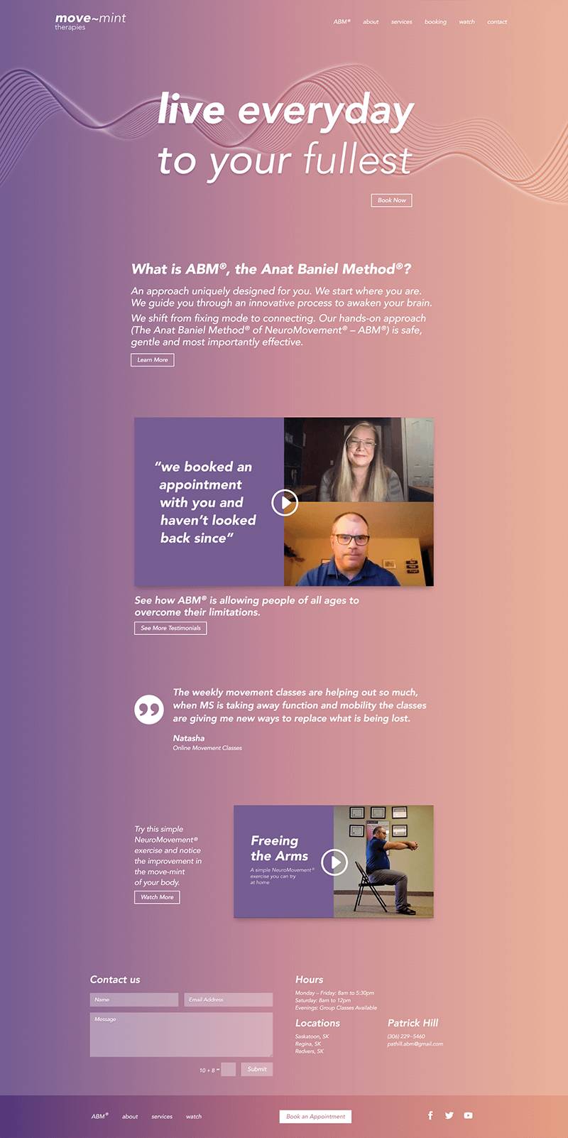
There are four main colour themes in move~mint’s palette, not including white. Each theme or gradient represents a desired tone of voice, or the desired emotional feeling or target audience for a message. The gradients (and colours) transition from dark to light representing the journey or path taken by someone undertaking therapy. Colour gradients were used to represent the brand characteristic of positive change and transformation. The use of gradients also embody human emotional feeling or mood. The tones of voice are named appropriately to activate the desired message. These include Gentle, Energy, Uplift, and Corporate.
A specific line pattern or wave formation was designed to pair with each of the four colour themes. The wave formations are visual depictions of brain waves which are also “m” shapes to reflect the name “move~mint”. The story of transformation was also incorporated into the waves by changing the thickness of the lines from thick to thin and the colour gradient from dark to light.
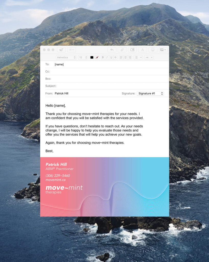
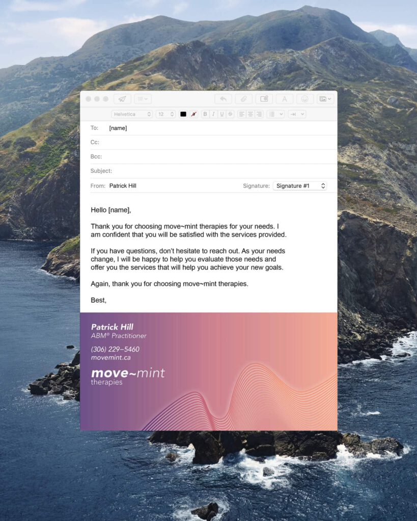
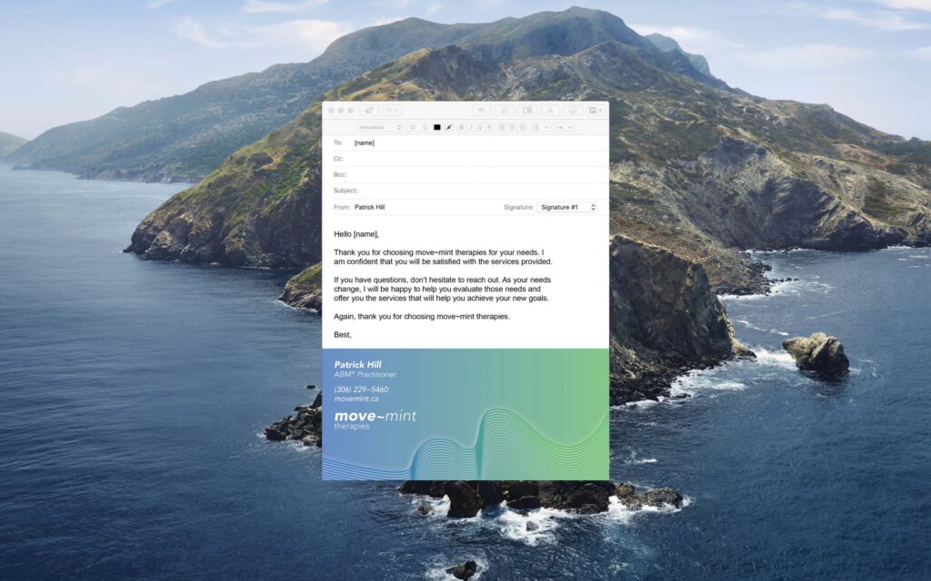
Email Signature
Designed to reinforce the main characteristics of the brand. Two slightly different email signatures were designed to take full advantage of modern email client technology with a fallback for older email applications.
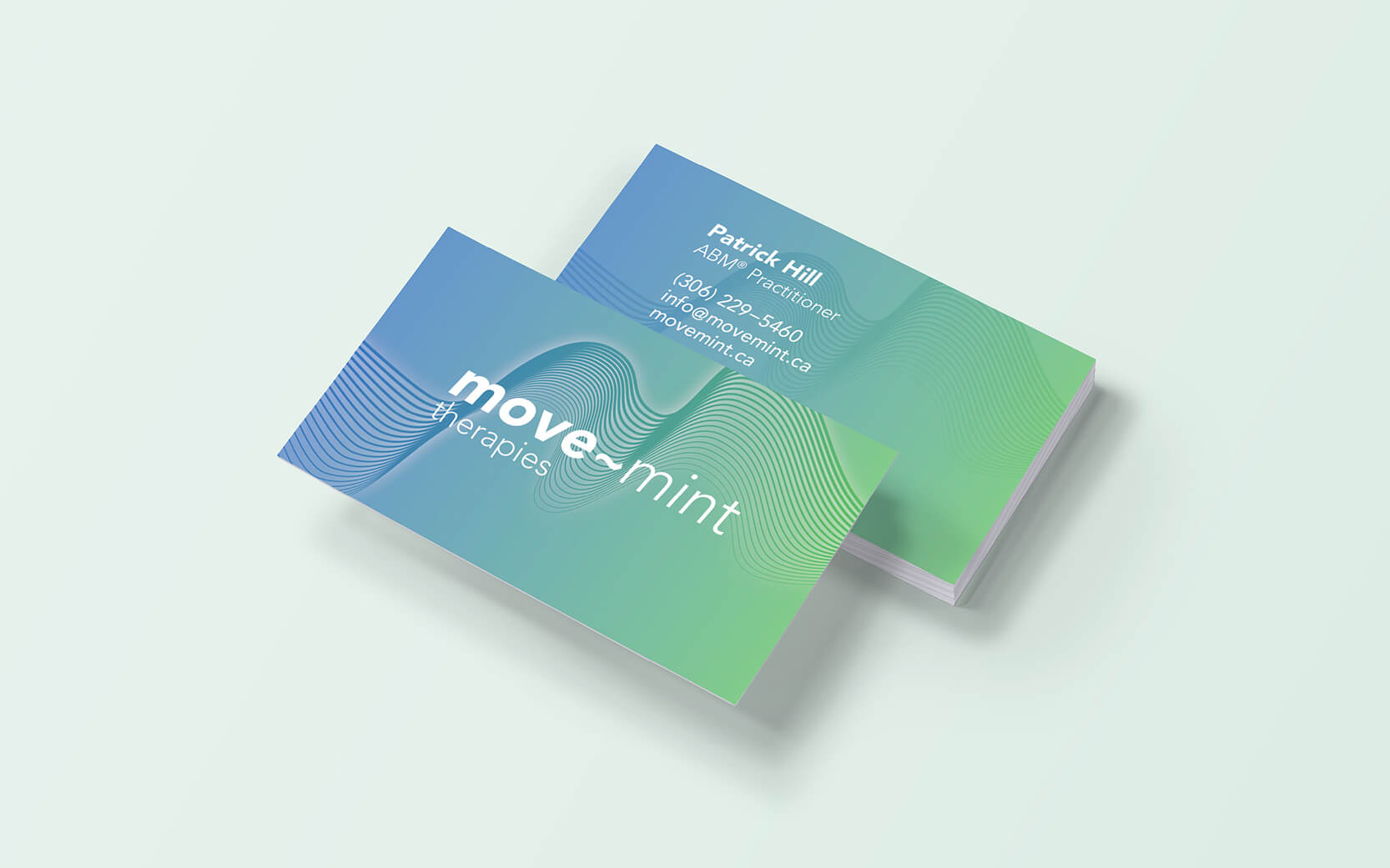
Business Cards
Four different colour business cards were designed incorporating each of the brand themes and tones of voice. A simple two-sided business card design that uses a slow deliberate pace to communicate its content. Accessibility and ease of reading were foremost considered in the design of the cards. Designed to encourage the viewer to interact and move the card by turning it over to view contact information.
Website Design & Development
The website is an extension of the move~mint brand. The essence of the brand is extended through its bold visual simplicity and human centred design qualities. The online environment enabled us to draw waves (lines) in the browser that actually moved. Each wave formation is randomly generated and drawn in the browser using code. This brings a static two dimensional brand to life in the form of a moving identity. The colour coded pages enabled easy navigation and the wealth of information was made more digestible through the use of horizontal text navigation.
The team I worked with at Zap is top notch! Through a rebrand and website development everyone I worked with is knowledgeable, easy to talk to, responsive to my many questions and patient with my limited experience with. I had an idea of what my new brand and website would look like and they blew me away with what they came up with. I couldn't have done what they did on my own and the comments that I get on how the brand and website look are all positive!
I would highly recommend Hannah and DJ to make your business stand out among the rest.