Project description
Prairie Food Link
Strategy
Brand development
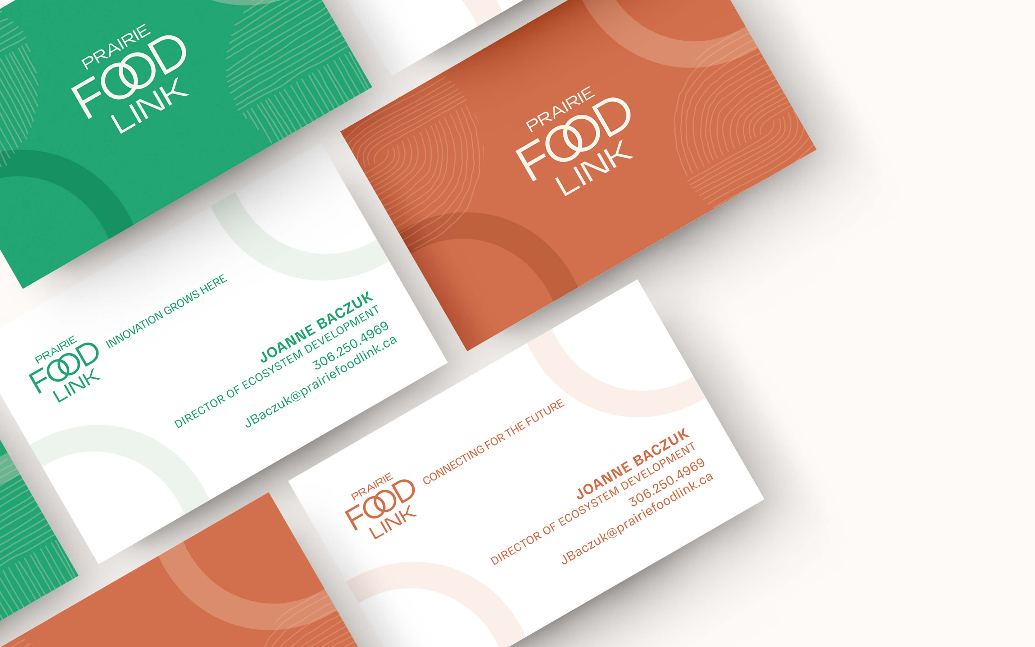
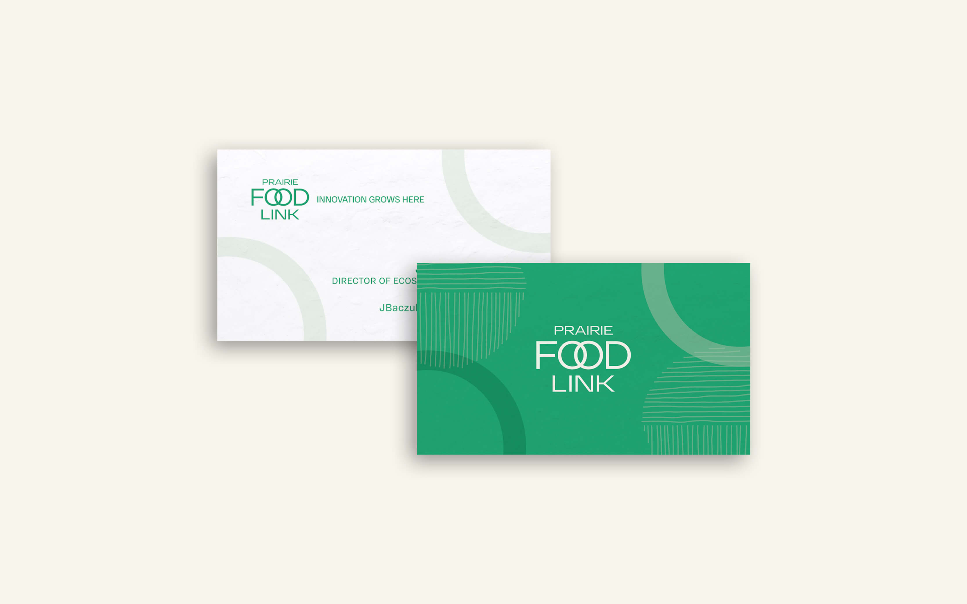
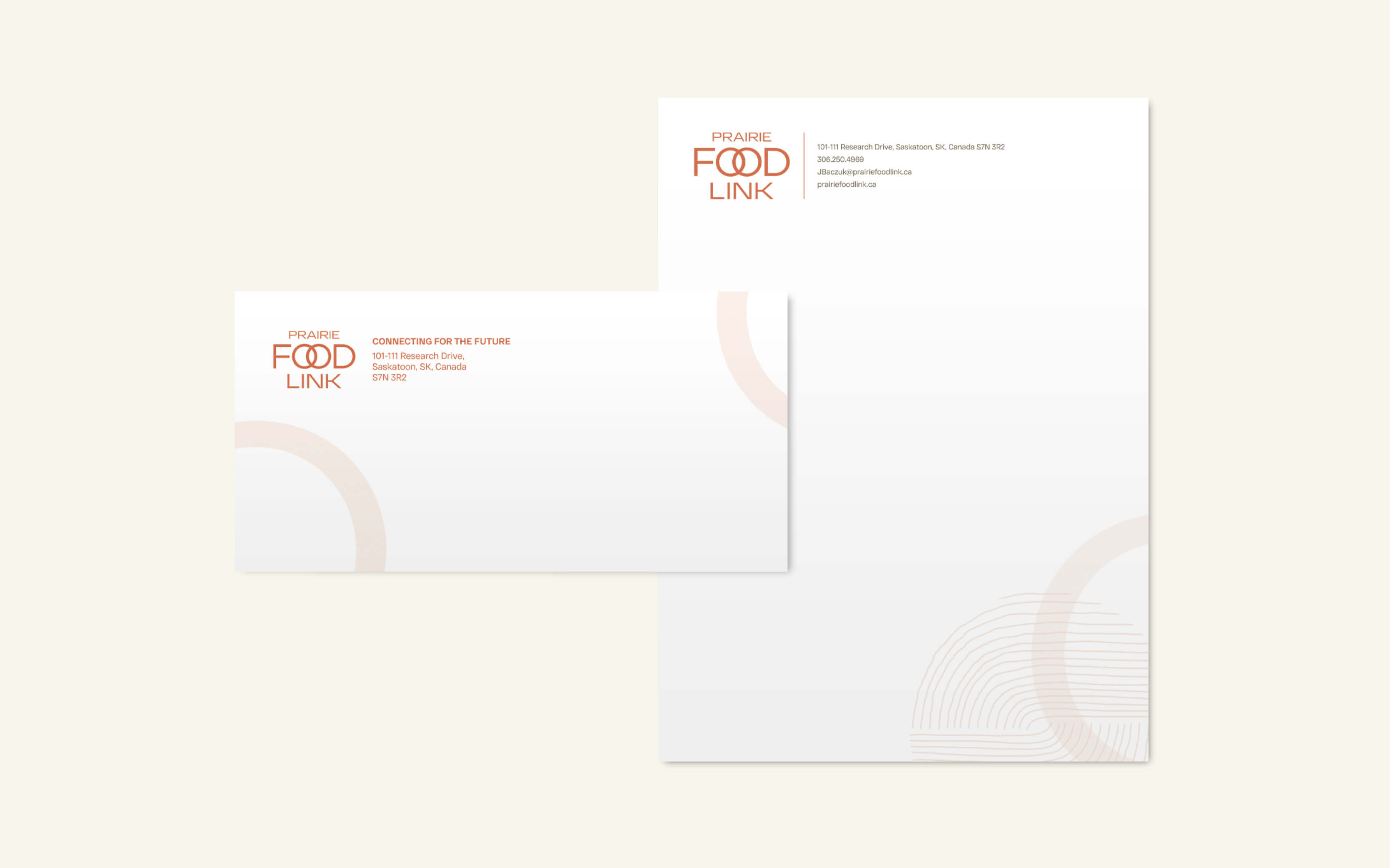
Stationary design
Naming
Pull up banner design
Website design & development
Custom social templates
Presentation templates
Prairie Food Link was formerly known as the Saskatoon Food & Ingredient Processing Cluster (SFIPC) They wanted to be rebranded to attract local and international members. The end goal is to elevate Saskatchewan premium products to the global market and attract businesses to expand to Saskatchewan.
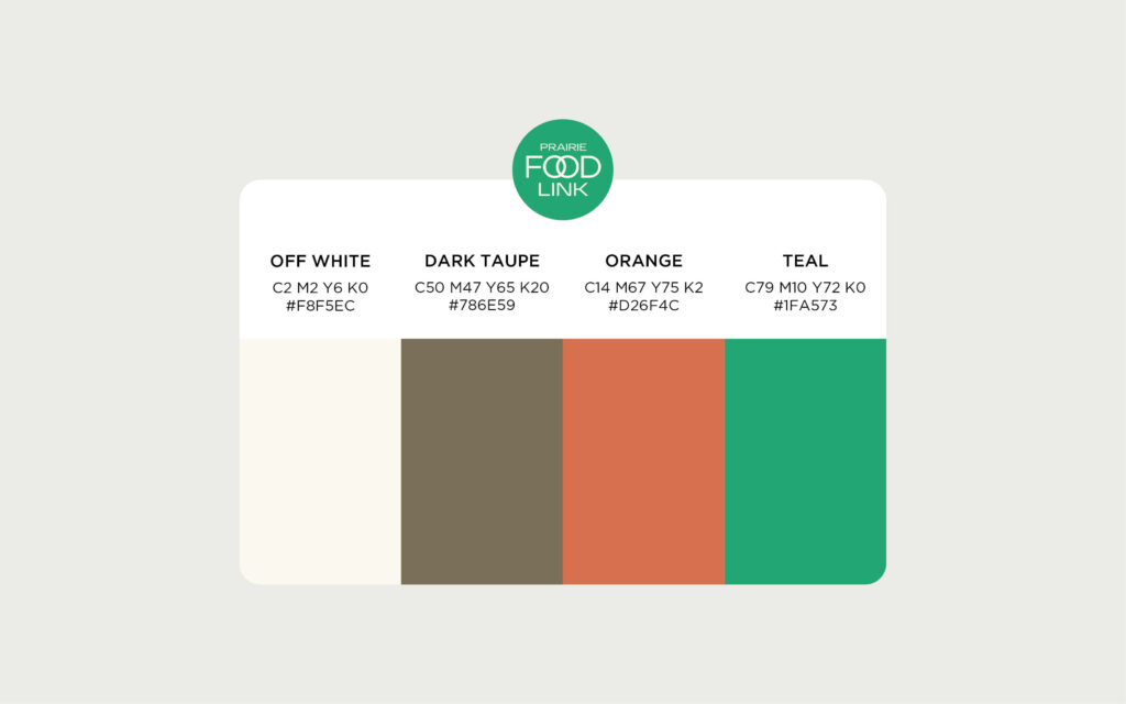
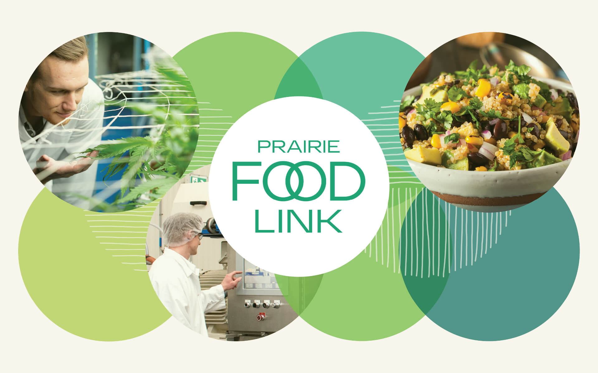
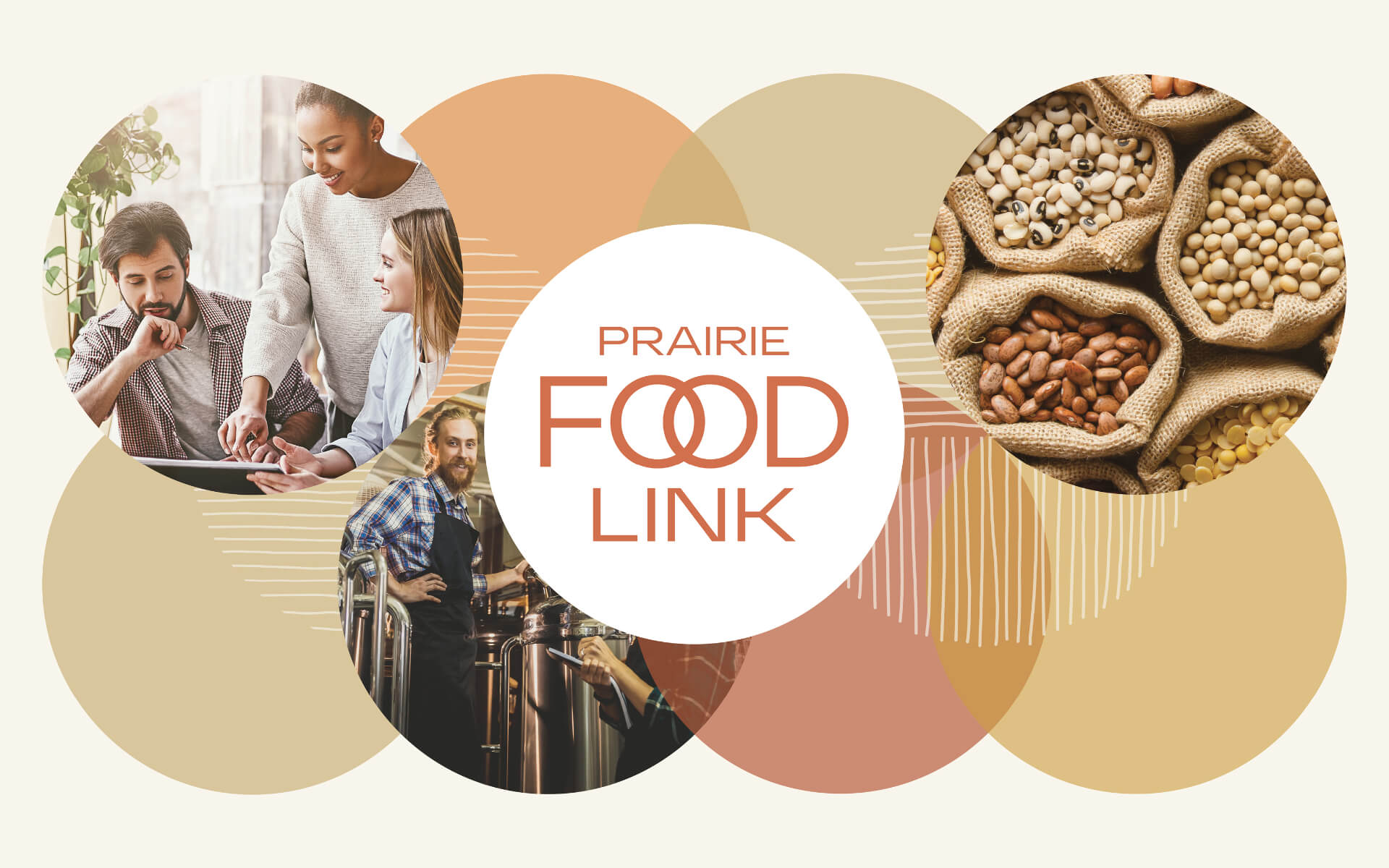
The two colorways represent seasons, they also represent different stages and seasons of business. Greens: starting with seed planting and growth, and Orange to represent harvest.
The logo is all about connection and collaboration between various sizes of businesses and linking Sask businesses with the world.
The textured graphics bring a down-to-earth feel to the polished look. They also represent the fields and ingredients that are grown in Saskatchewan soil. Lastly the circles represent linking, seasons and continuation of growth.
Lively, professional, natural and collaborative.
